Your website is often the first place engaged couples go when researching wedding vendors. Whether you are a wedding planner, photographer, florist, or mobile bar service, your website plays a major role in whether someone decides to inquire with you.
Many wedding professionals invest time and energy into their websites, but small mistakes can unintentionally push potential clients away.
Understanding these common website mistakes can help you create a stronger online presence that attracts the right couples.
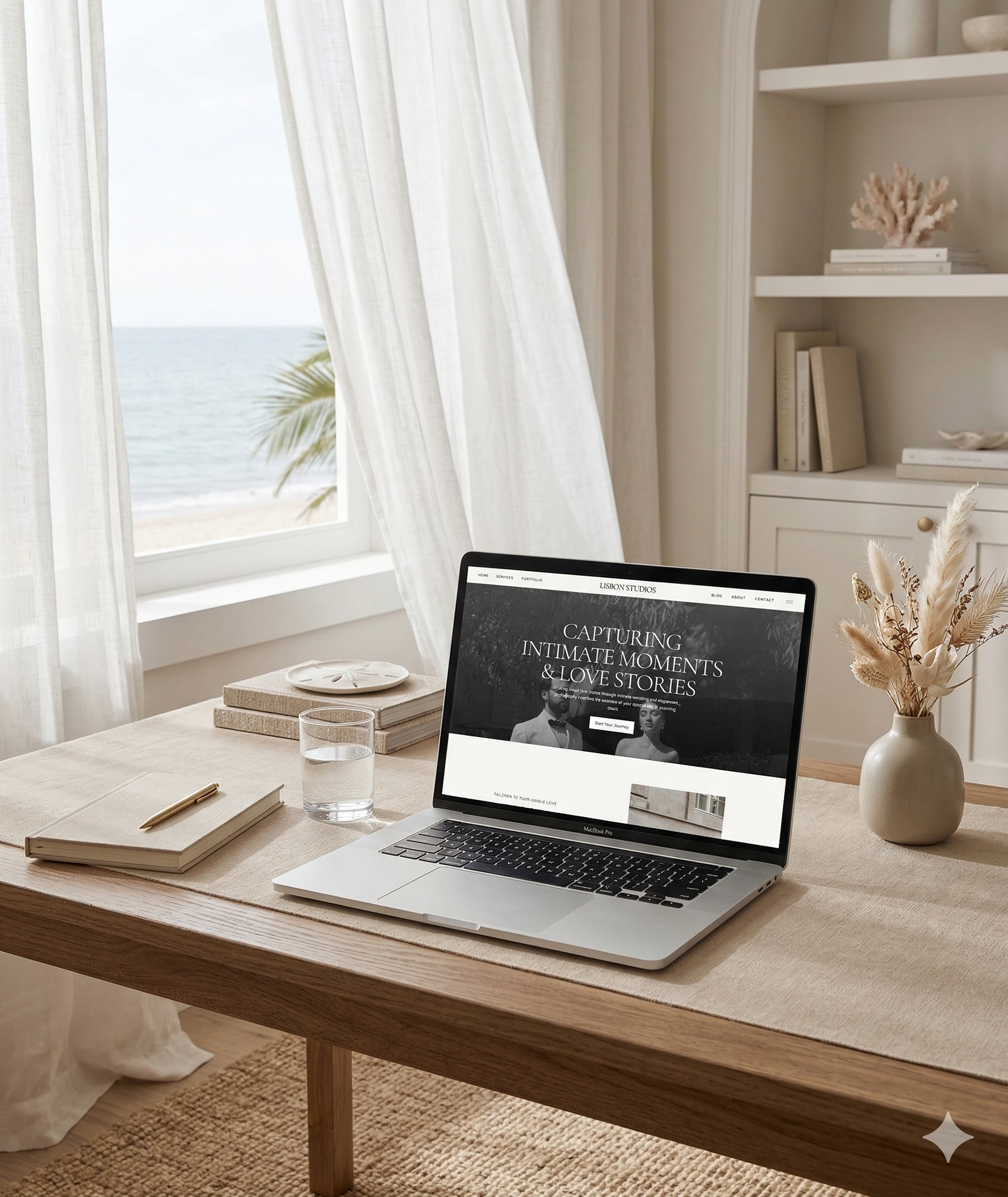
Mistake One: Confusing Navigation
When couples visit your website, they should immediately know where to click.
If your menu is cluttered or difficult to understand, visitors may become frustrated and leave your site.
Clear navigation with pages like Home, About, Services, Portfolio, and Contact keeps your website easy to explore.
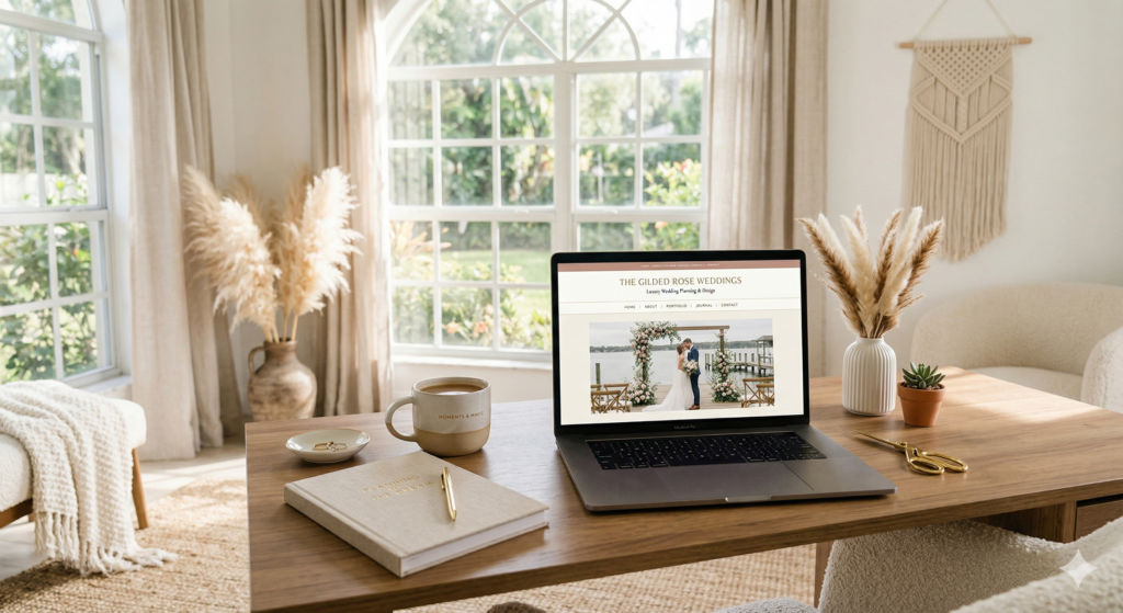
Mistake Two: No Clear Call-to-Action
One of the biggest website mistakes wedding vendors make is forgetting to clearly guide visitors toward the next step.
Your website should clearly encourage couples to inquire, schedule a consultation, or view your packages.
Without a strong call-to-action, visitors may enjoy browsing your website but leave without contacting you.
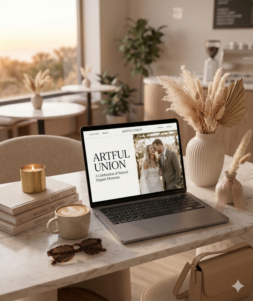
Mistake Three: Too Much Text Without Visuals
Wedding vendors operate in a visual industry. If your website is heavy on text but light on images, visitors may lose interest quickly.
Beautiful photography of weddings, venues, and real client experiences helps couples imagine what working with you would feel like.
Mistake Four: Slow Website Speed
If your website takes too long to load, many visitors will leave before they even see your content.
Optimizing images and ensuring your website runs smoothly is essential for keeping potential clients engaged.
Mistake Five: No Testimonials
Couples planning their wedding want reassurance that they are choosing the right vendor.
Client testimonials and reviews build credibility and demonstrate that others have trusted you for their special day.
Mistake Six: Lack of Personality
Couples are not just hiring a service. They are hiring a person.
Your website should reflect who you are, your style, and your approach to working with clients.
An engaging about page and personal messaging help couples feel connected to you.
Mistake Seven: A Website That Feels Outdated
Design trends change, and a website that looks outdated can unintentionally signal that a business may not be current or professional.
Modern, clean website design helps position your brand as trustworthy and elevated.
Ready for a Website That Actually Books Your Dream Clients?
When wedding vendors avoid these common mistakes and design their website strategically, they create an experience that feels polished, professional, and inviting for engaged couples.
If you’re reading this and realizing your website might be turning couples away instead of drawing them in, you’re not alone and more importantly, it’s fixable.
Your website should feel like a seamless extension of your brand, one that reflects your style, builds instant trust, and guides couples toward confidently inquiring with you.
That’s exactly what I specialize in.
I work with wedding professionals to create strategic, elevated brands and websites that not only look beautiful but are intentionally designed to convert visitors into booked clients.
From your messaging to your layout to the overall experience, every detail is crafted to position you as the obvious choice in your industry.
If you’re ready for a website that finally reflects the level of your work and attracts the right couples with ease, you can explore my branding and website design services below.


COMMENTS